Brand kit · 2026 · By StudioLysch®
Buildersoul
Brick by brick Step by step One by one
Builders are the body and soul of business. This is the mark we put on what we build with them — take it, and use it well.
The symbol
O, V and C, joined into one figure: the builder.
It comes from the marks makers have always left on their work — Roman coins, seals and stamps, a signature cut into stone or struck into metal. What such a mark shows is what exists before any work does: a person, and what they can see.
The oval holds the figure the way a coin holds a face. Its strokes end in the same flared serifs as the wordmark, with the same swell and the same upright axis, so the two always read as one hand.
Flared serifsStrokes widen into their ends rather than stopping on a bracket.
ContrastThick and thin, as a chisel or a pen would leave them.
Vertical axisUpright, centred, standing on its own feet.
01
Assets
Every file in the package, by what it is for. Each comes with a transparent background.
Download the kitZIP · 11 MBWhich file?
- On a screen
- Slides, documents, e-mail, the web, social. SVG wherever it is accepted, PNG everywhere else.
- At the printer
- Offset and digital print. PDF or EPS, in CMYK.
- In a spot colour
- Stationery, gifts, screen printing, foil. Pantone — only when the printer asks for it.
Logo
Horizontal · Positive
On Off White and Cinza

Horizontal · Negative
On Chumbo and Preto
Vertical · Positive
On Off White and Cinza
Vertical · Negative
On Chumbo and Preto
Symbol & wordmark

Symbol · Black
On light grounds, and for favicons and the smallest sizes.

Symbol · Off White
On Chumbo, Preto and photographs.
Avatar
Profile pictures and app icons: Off White on Preto, 1024 px.

Wordmark · Black
The wordmark without the symbol, for pieces that use the two apart.

Wordmark · Off White
The same, for Chumbo, Preto and photographs.

Favicon
The black symbol alone, square and transparent, 512 px.
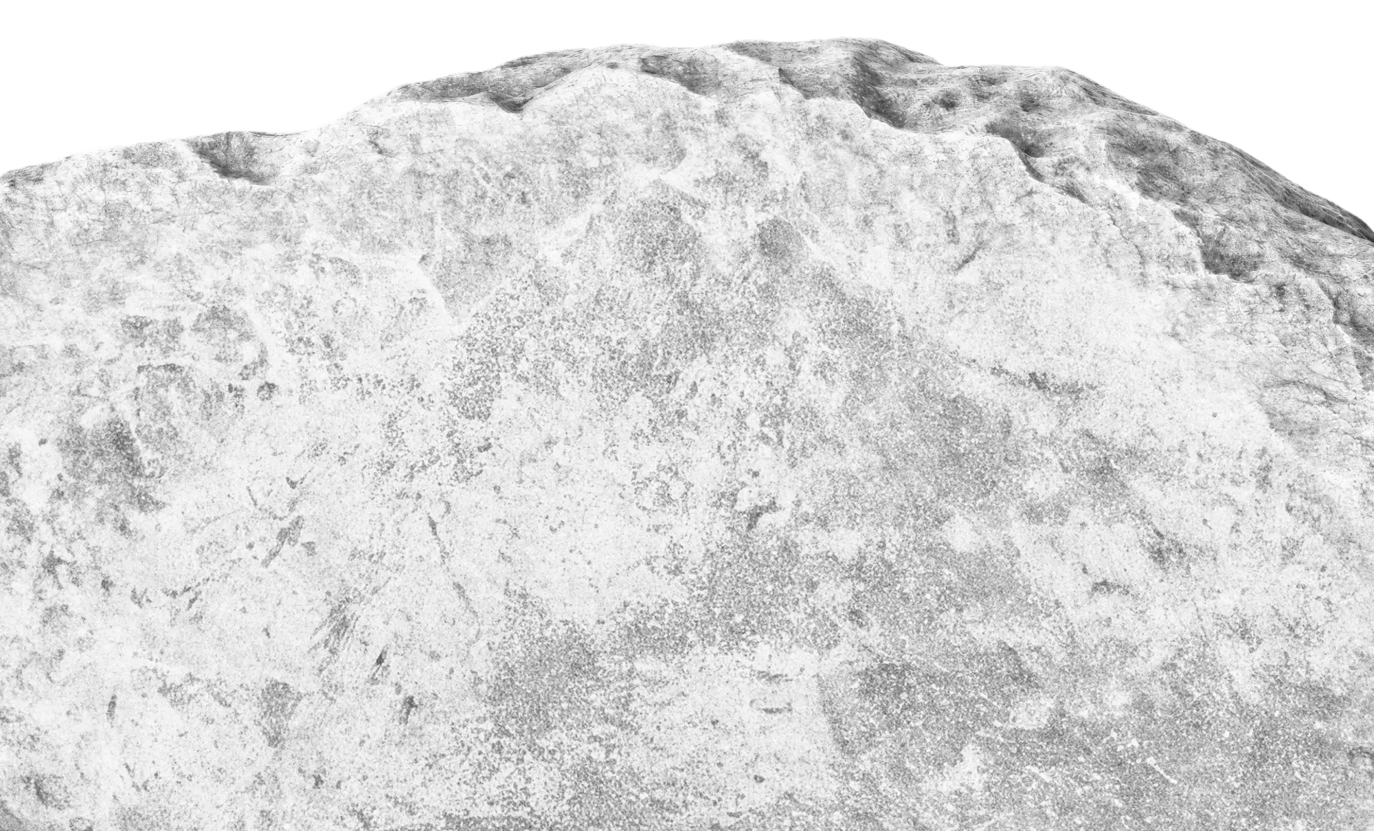
Stones
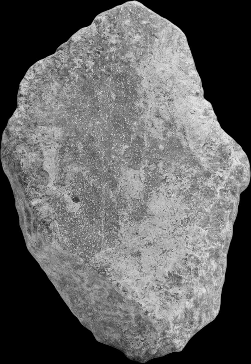
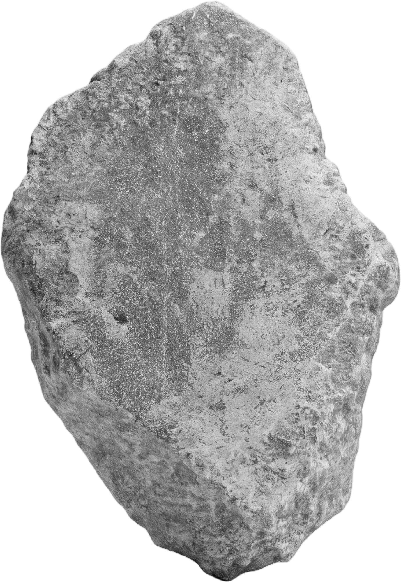
Upright
Transparent, 2000 px.
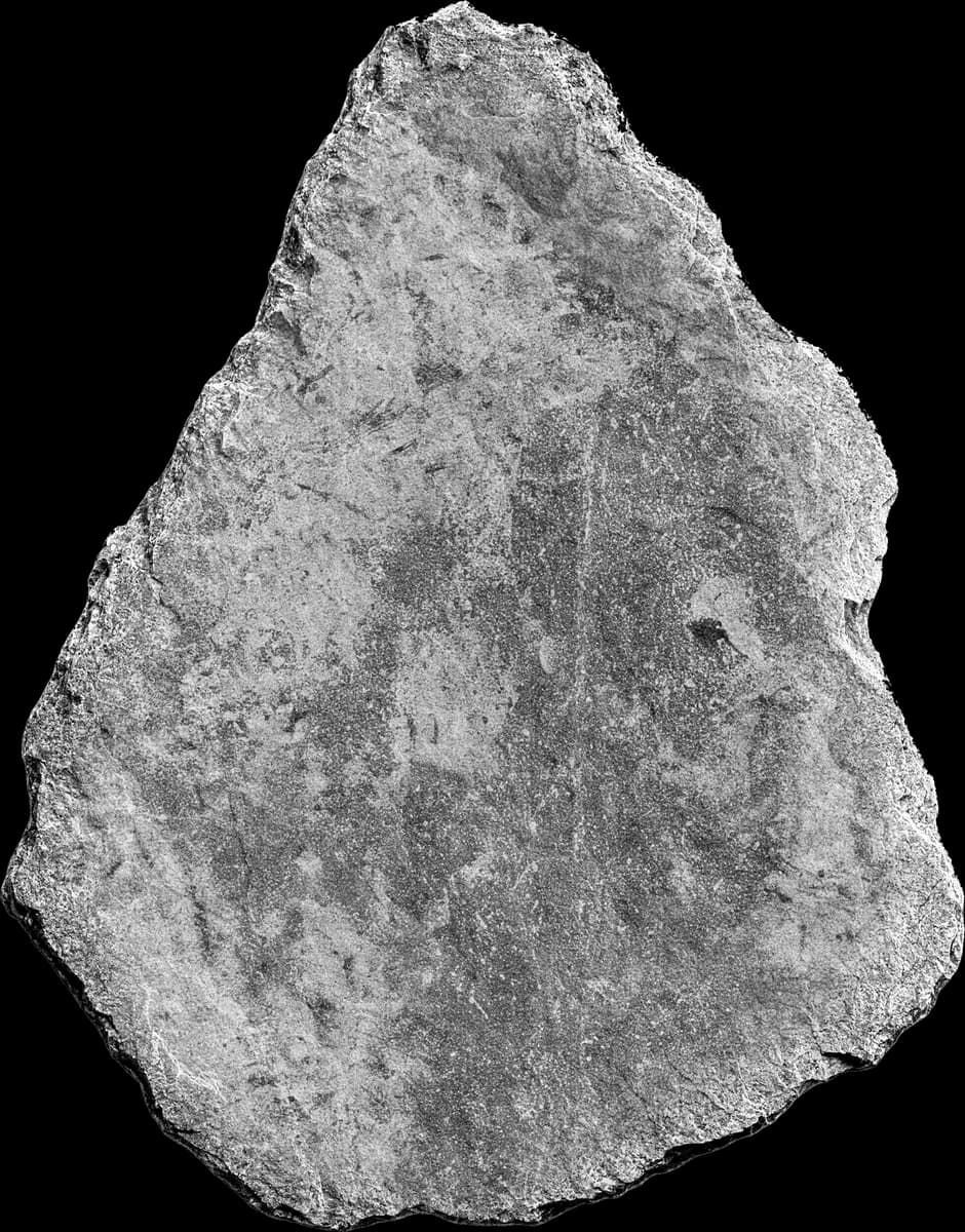
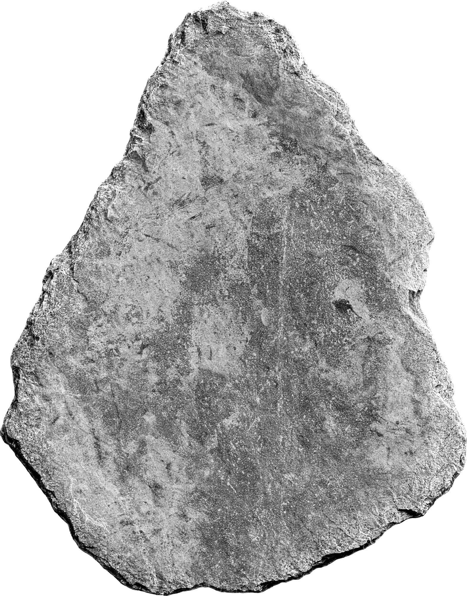
Shard
Transparent, 2000 px.
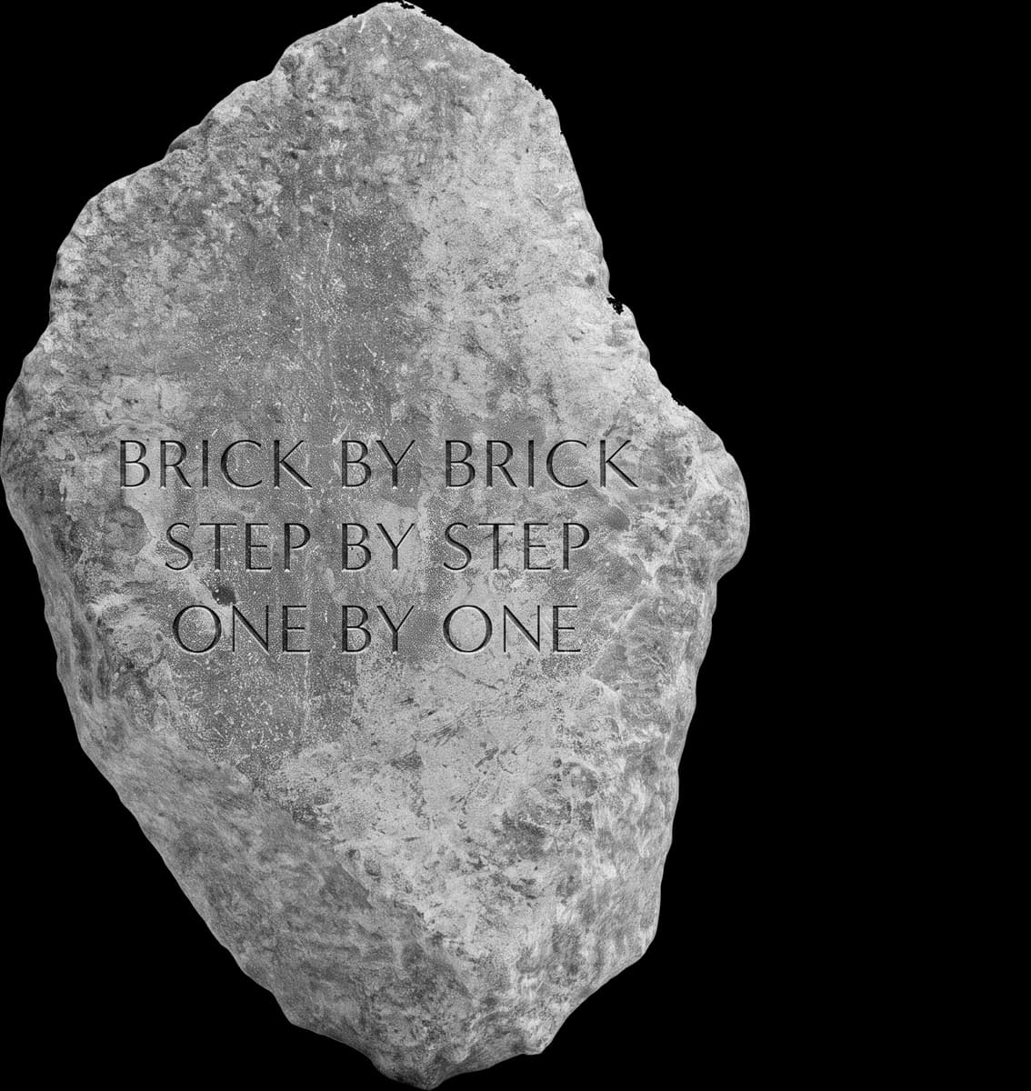
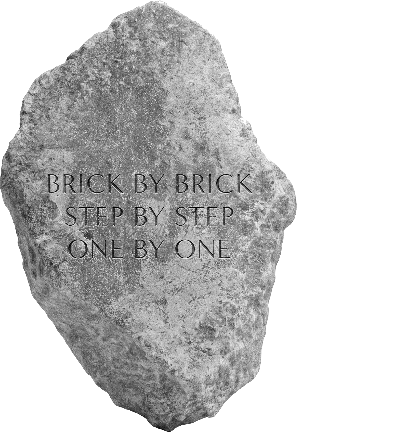
Inscribed
Transparent, 2000 px.
Photography & backgrounds
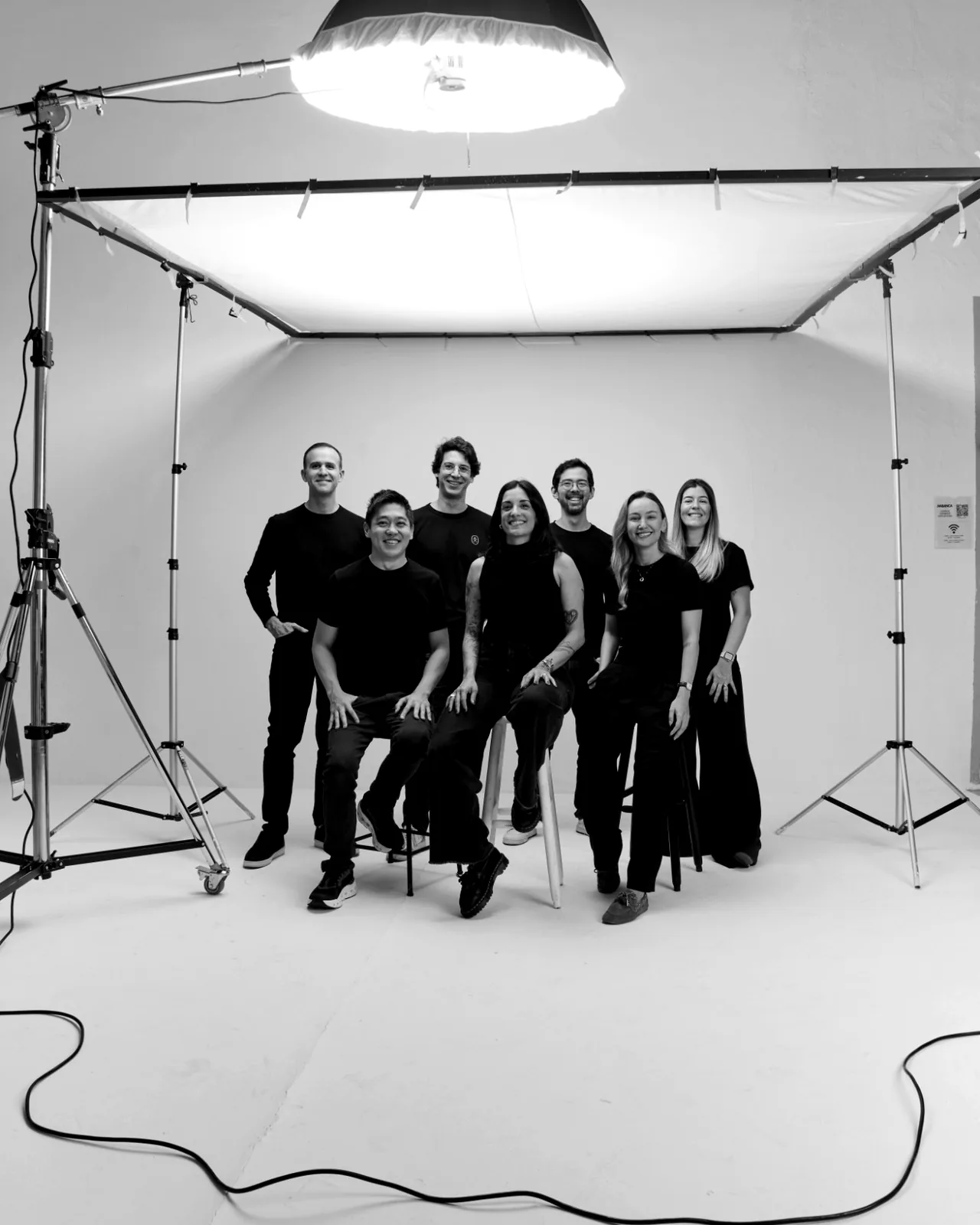
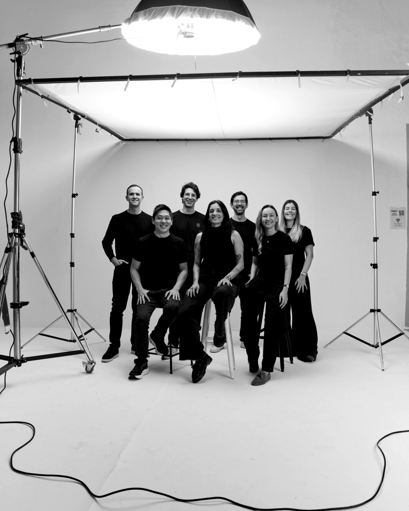
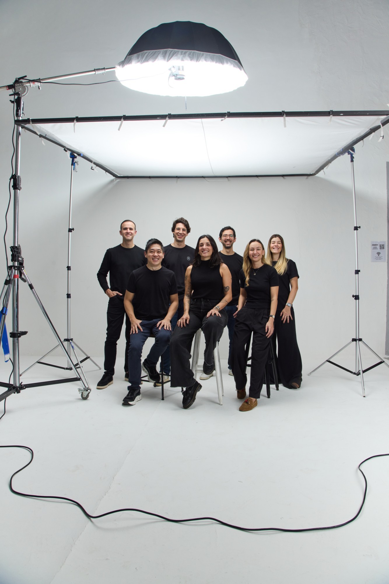
The team
Black and white, 4:5 — and the colour original.
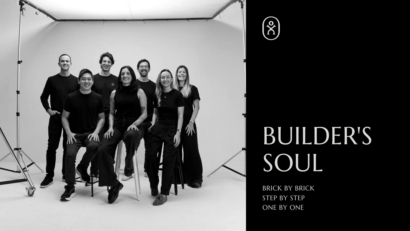
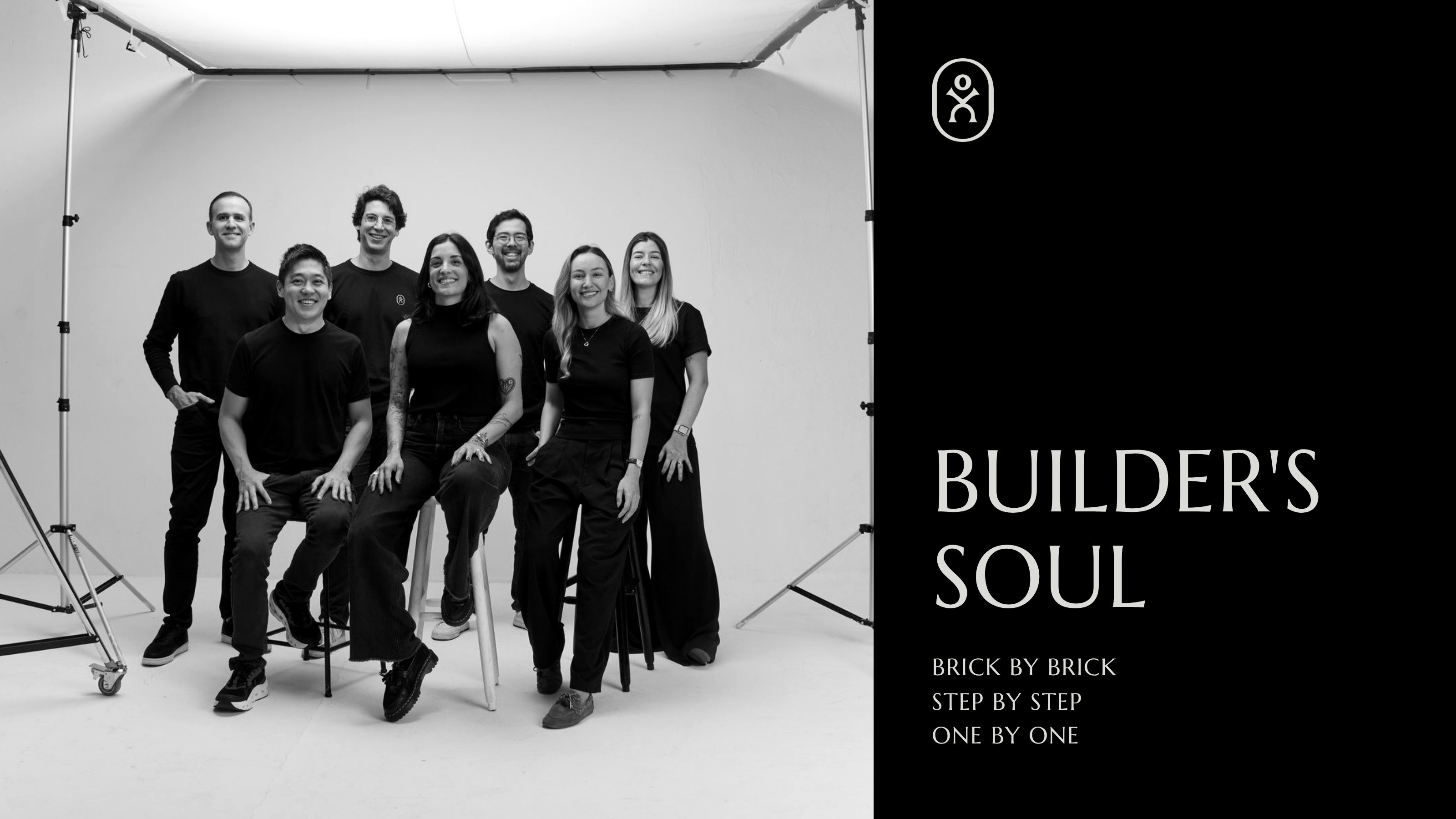
Background I
For calls and desktops, 3200 × 1800.
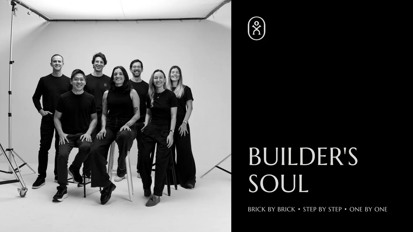
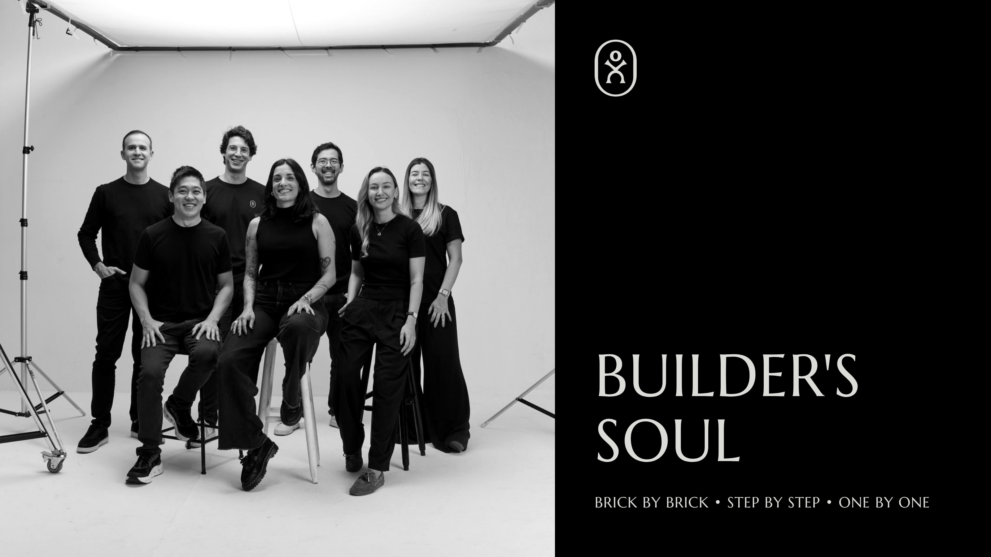
Background II
For calls and desktops, 3200 × 1800.
02
Colours
Four greys from black to Off White. Preto, Chumbo and Off White are the ground of everything; Cinza is the accent, used selectively, for emphasis and contrast. Click any value to copy it.
Preto
- Hex
- RGB
- CMYK
- Pantone
Chumbo
- Hex
- RGB
- CMYK
- Pantone
Cinza
- Hex
- RGB
- CMYK
- Pantone
Off White
- Hex
- RGB
- CMYK
- Pantone
Support
Three cool tones for details in presentations and interfaces — very sparingly, and only when the greys cannot do it.
Vinho
- Hex
- RGB
75%50%25%Oliva
- Hex
- RGB
75%50%25%Azul
- Hex
- RGB
75%50%25%
03
Typography
Two families. Minerva Modern is named for the Roman goddess of wisdom and craft — not the rush of conquest but the intelligence that plans and builds. Neue Haas Grotesk Text carries the small print. Both are licensed through Adobe Fonts.
Principal
Minerva Modern
by T-26
ABCDEFGHIJKLMNOPQRSTUVWXYZ
abcdefghijklmnopqrstuvwxyz
0123456789 & — , . ; : ! ?
- Regular for running text, Bold for emphasis.
- Titles always in capitals.
BUILDERS ARE THE BODY AND SOUL OF BUSINESS
Support
Neue Haas Grotesk Text
by Max Miedinger
ABCDEFGHIJKLMNOPQRSTUVWXYZ
abcdefghijklmnopqrstuvwxyz
0123456789 & — , . ; : ! ?
- Regular for running text, Bold for emphasis.
- Captions, labels, interfaces and fine print.
BRICK BY BRICK, STEP BY STEP, ONE BY ONE.
The lines above are live — type over them.
04
Elements
The stone: permanence, transformation, making. Its texture brings variation to an identity of flat colour, and an inscription cut into it is a signature — proof of who made it.
Plain
On its own, as ornament or as a field of texture. Never coloured, never flattened — it is a photograph of a real stone.
Inscribed
Words cut into the face, in Minerva Modern capitals, centred. The stone carries the line rather than sitting behind it.
In a layout
As a carved inscription would be: a block of type in one solid colour, perhaps over a photograph, with small lines of text set in the margins as a frame.
05
Builder backstage
Black and white, with a contrast that holds tension and stays inside the palette. Real people only — the builders and the people of ONEVC, never models. And the set stays in the picture: backdrop, stands, cables, the light itself. It is a portrait of building, which is never done alone.
- Black and white, always.
- White, diffuse light, as from a window on a clear day.
- The equipment in frame: seamless paper, stands, cables.
- Standing or on a plain stool, looking at the camera.
- Real skin, a relaxed pose, nothing retouched to plastic.
06
Usage
The few rules that keep the mark clear wherever it lands.
Positive or negative
The black logo on Off White and Cinza; the Off White logo on Chumbo and Preto. Nothing else.
- Preto
- Chumbo
- Cinza
- Off White
Minimum size
Never under 30 px tall — the lockup, and the symbol on its own.
Apart
In quieter, more conceptual pieces the symbol and the wordmark can stand apart, or the symbol alone. Scaled independently, one may be up to four times the other — no more.
Symbol × 4Wordmark × 4Symbol in use
Profile pictures and app icons: the Off White symbol on Preto. For a favicon and the smallest sizes, the black symbol alone.
 AvatarApp iconONEVCFavicon
Don’t
The mark is black or Off White, whole, on a ground it stands out from.
Not in Chumbo or Cinza
Not without contrast

Not in two colours
All of it, in one file.
Download the kitZIP · 11 MB